
Tools

AI資料作成
AIプレゼンテーション
BEST
AI文章作成·作文
AI ポスター
AIかんたん作成
AI画像生成
AI動画生成
HOT
AI キャラメーカー
AI アイコン作成ツール
AI アイコンメーカー
AIイラスト生成
AI ロゴメーカー
AI フリー背景素材
AIクイック編集
AI画像編集
背景除去
高画質化
写真イラスト化
HOT
New!

イラスト一覧を見る
幅広いシーンで使える高品質イラストをご用意しています。
Plans


Anti-bullying poster ideas and examples for classrooms, campaigns, and parents: what to put on one, what to avoid, and templates to edit for October.
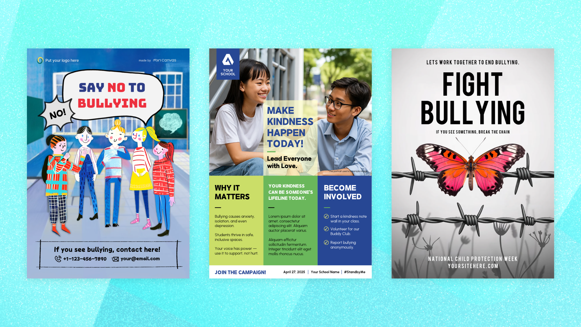
Most anti-bullying posters say "stop bullying" and stop there, which means a student who already knows bullying is wrong walks past and learns nothing. The posters that change anything tell a specific person a specific thing they can do, and they name where the wall is: a corridor, a campaign week, a parents' evening.
October is National Bullying Prevention Month, run in the US by PACER Center, which is when most school posters go up. The month has a recognizable centerpiece in Unity Day, when students wear and share orange for kindness, acceptance, and inclusion.
That is the easy part to organize. The hard part is that a poster has a few seconds and one wall, and most of them spend it restating something the reader already agrees with.
This article covers why posters still earn their space in a school, where you are likely to put one and what it should say in each place, what belongs on any version of it, how to design it without the usual mistakes, and which templates to start from.
Start with the scale. PACER Center reports that one out of every five students say they have been bullied, so in a class of thirty that is a handful of people reading your poster who are not reading it in the abstract.
A poster earns its place in a school for a reason a newsletter cannot match. It reaches students who were not looking for the message, in the ordinary places where they already are, and it stays up long enough to be seen many times rather than once. That repetition in a corridor does work a single assembly cannot.
It also reaches the group that actually changes outcomes. StopBullying.gov notes that bullying affects all youth, including those who witness it, and that there is no single profile of a young person involved. Most of the people in front of your poster are neither the student being harmed nor the student doing the harm, and they are the ones deciding whether to say something, which makes them the audience with the most room to act.
That is the honest case for the wall space. A poster is not going to resolve a situation on its own, but it can make the next step obvious to someone who already wanted to help and did not know what to do.
That also sets the standard for what goes on it. If a poster might be the thing a student reads before deciding to tell an adult, then the part that matters most is not the slogan but whether the poster tells them who to tell.
Where the poster hangs decides how much of that you can fit on it. The setting drives the wording, the reading distance, and how much detail the sheet can carry, so each section below pairs a place with what the poster should say there and a template that already fits the shape.
Most schools start here, and this is the poster students see every day for a term, which makes it the one that should carry the reporting route. Dwell time is low and repetition is high, so the wording has to survive being read at walking pace and still be useful on the twentieth pass.
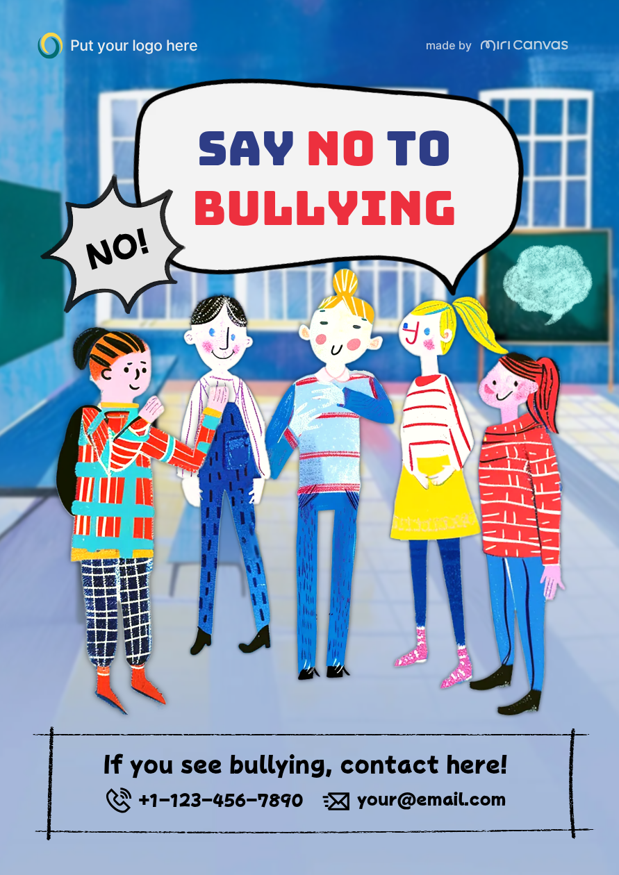
Keep it to one line of message and one block of practical detail: who to tell, where that person is, and what happens next. If your school uses an anonymous form or a drop box, this is the poster that should carry it.
A layout built for a mixed group of students, with a clear space for contact details, does more here than a slogan. This template puts illustrated students of different appearances across the middle and reserves a bordered strip at the bottom for a phone number and an email address, which is exactly the part most classroom posters leave out.
A corridor poster earns its keep by staying up. A campaign poster does the opposite, because it has a week at most and it is asking for participation rather than attention, which means it needs a joinable action and a date. Unity Day is the natural anchor in October, and PACER also publishes a four-week activity kit for K-12 classrooms if your campaign needs more than one event.
The wording changes accordingly, so instead of describing the problem, name the thing students can sign up for: a kindness wall, a buddy scheme, an orange day, a pledge.
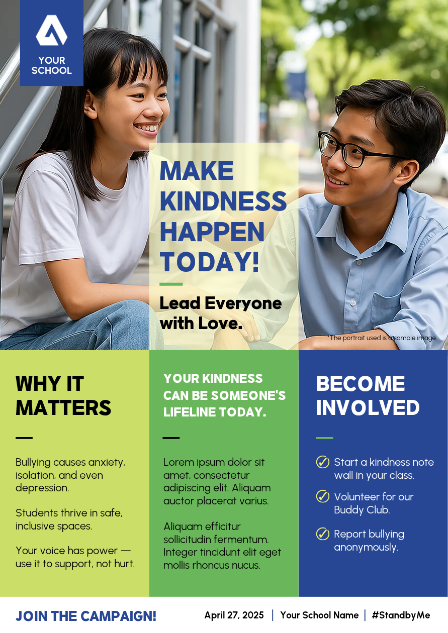
This template is built as a campaign rather than a statement. It runs a headline over student photographs and then splits the lower half into why it matters, what kindness does, and a short list of ways to get involved, with a campaign date and hashtag line at the foot. It comes in green, which suits a kindness campaign on its own, and the palette is editable, so a week pinned to Unity Day can go out in orange instead.
Both of those are written for students. The register shifts once the reader is an adult, and parents want to know what the school does, how to raise a concern, and what to watch for at home. Community noticeboards and social posts reach the same people and tolerate a plainer, more serious design, and this is also where a portrait poster earns a second life, because the same shape works as a social post without a rebuild.
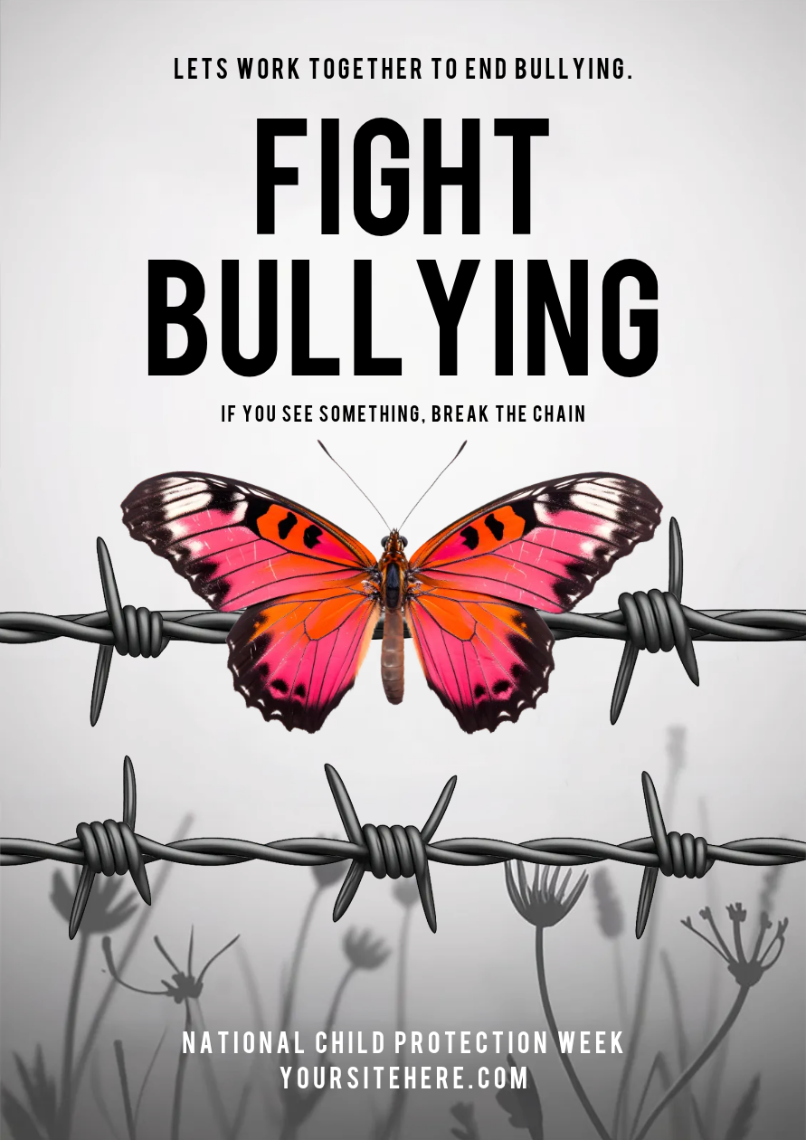
A restrained adult-facing design suits this better than a classroom illustration. This template pairs a plain headline with a single strong image and a line about seeing something and acting on it, which reads as addressed to adults rather than to students.
Decide which of these you are making before you open any of them. A hallway poster moved to a parents' evening reads as childish, and a parents' poster on a corridor wall goes unread.
Whichever of the three you are making, the same short list decides whether it works.
One message. Decide whether the poster is telling students what bullying is, telling them what to do when they see it, promoting a campaign, or telling parents how to raise a concern. Those are four posters. A single sheet trying to be all of them is the reason most of them get ignored.
The reporting route, in specifics. This is the part worth protecting when space runs short. Name the adult, the room, the form, or the address. If the route is anonymous, say so, because that changes whether some students use it. "Tell someone" is a sentiment; "Room 12, or the form at the link below" is an instruction.
A definition, if the poster is there to teach. Students often think bullying means any conflict. The federal definition, published by the CDC and the Department of Education and summarized on StopBullying.gov, has three parts: unwanted aggressive behavior, an observed or perceived power imbalance, and repetition or a strong likelihood of repetition. Those three lines fit on a poster and do more than a slogan.
Something for the bystander. Most readers are witnesses, so give them a small concrete act rather than a call to bravery: sit with the person, say something afterward, tell an adult, do not share the post.
A source and a year on any statistic. Numbers age, so put the source and the year in small type, take current figures from an authority rather than from another poster, and refresh them each October instead of reprinting last year's sheet.
Those five decide what the poster says. The ones below decide whether anyone reads it.
Use orange if the poster is about Unity Day. Orange is the recognized color of that campaign, the way a ribbon is recognized elsewhere. A poster that uses it reads as part of something national rather than as one school's notice. A poster that ignores it for a nicer palette gives that up for nothing. Template colors are editable, so choosing a layout that works and moving it to orange is usually easier than holding out for a poster that is orange already.
Do not draw the bully and the victim. The two-character illustration is the default for this topic, and it works against the message. StopBullying.gov is explicit that there is no single profile of a young person involved, and the reader you most want is the witness, who sees themselves in neither figure. Show a group, or show nobody and use the words.
Write for the back of the corridor. Print the headline and read it from where students will actually be standing. If the message is only legible up close, it is a handout with a poster's dimensions.
Keep the tone out of fear. Distressing imagery gets attention and then gets avoided, which is the opposite of what a poster on a wall needs. For a school audience the useful register is calm and matter of fact: this is what it is, this is what you can do, this is who to tell.
Match the age. A design that works for a sixth-form noticeboard will read as babyish to the same students two years earlier, and the reverse is worse. Pick the illustration style for the age group actually walking past it.
Leave the margins alone. Filling every corner is what makes a poster look like an official notice, which is what students have learned to ignore. Empty space is what makes the one line you care about look deliberate.
None of that means starting from an empty page. The three templates above are all portrait, which suits printing, noticeboards, and social posts without a rebuild. Two of them are free and one is on the premium tier, and all three open in the free MiriCanvas editor in a browser.
Treat any of them as a frame, not a finished poster. Replace the sample copy with your one message, put your school's actual reporting route where the placeholder contact details sit, and delete rather than fill any block you do not need. A half-empty poster reads better than a full one.
If none of them fits, browse the wider anti-bullying poster templates and pick a layout with room for your message rather than a theme you have to work around. The questions below cover what tends to come up once you have one open.
October, every year in the US, organized by PACER Center. Unity Day falls within it and is the day students wear and share orange for kindness, acceptance, and inclusion. If your posters are tied to the month, print and place them in late September so they are already on the wall when it starts.
One message and one specific next step. The next step is the part that matters: who to tell, where that person is, and whether the route is anonymous. If the poster is meant to teach rather than to promote a campaign, the three-part federal definition of bullying is more useful on a wall than a slogan.
Two of the three linked in this article are free and one is on the premium tier. The MiriCanvas editor itself is free to use in a browser, and the wider poster library has more free layouts you can adapt by replacing the text and images.
Portrait suits printed posters, classroom walls, and noticeboards, and the same shape carries to a social post without reworking the layout. Build one size properly and check the result at each size rather than stretching the original.
Orange if the poster is tied to Unity Day, because that is the recognized campaign color. Otherwise pick for legibility rather than for mood: one strong contrast between the headline and the background does more than a palette. Keep dark, heavy treatments off posters aimed at younger students.
Fewer words, one idea, and a picture that shows a group rather than a confrontation. Focus on the action you want rather than the behavior you do not: sit with someone, tell an adult, include people. Keep the reporting route on the poster, in language a younger student would actually use.
Pick a template, edit the text and images, and your poster is ready in minutes.
Browse templates


