
Tools

AI資料作成
AIプレゼンテーション
BEST
AI文章作成·作文
AI ポスター
AIかんたん作成
AI画像生成
AI動画生成
HOT
AI キャラメーカー
AI アイコン作成ツール
AI アイコンメーカー
AIイラスト生成
AI ロゴメーカー
AI フリー背景素材
AIクイック編集
AI画像編集
背景除去
高画質化
写真イラスト化
HOT
New!

イラスト一覧を見る
幅広いシーンで使える高品質イラストをご用意しています。
Plans


Make a breast cancer awareness presentation that respects the room: what to include, how to handle statistics and stories, and free October templates.
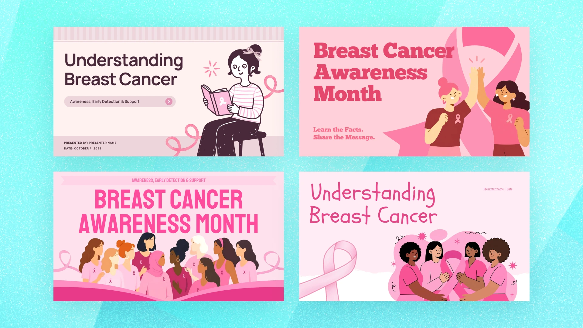
A breast cancer awareness presentation is not really a design task. It is a short window in which you ask a room of people to take something seriously, and possibly to book a screening they have been putting off. The slides matter because they either carry that message or get in its way.
October is Breast Cancer Awareness Month, which is when most of these presentations get delivered: a lunch and learn at work, a nursing class campaign, a patient education session, a community event.
The temptation is to treat it as a slide-building exercise. Pick a pink template, drop in some statistics, add a ribbon, done. That produces something nobody remembers and nobody acts on, and in a room where someone is quietly living with this, it can land worse than that.
This article covers why the message is worth your care, where these presentations actually get given and which template suits each setting, what belongs in one, and how to design and deliver it without hitting the usual wrong notes.
The scale is the first thing worth sitting with. According to the American Cancer Society, the average lifetime risk that a woman in the US develops breast cancer is about 13 percent, which is roughly 1 in 8 women. Whatever size your audience is, do the arithmetic before you write the first slide. This is not a topic that happens to other people.
That also means the room is never neutral. Some of the people listening have had a biopsy. Some are in treatment. Some lost a mother or a sister and have not talked about it at work. A presentation that treats breast cancer as an interesting set of numbers will be heard very differently by them than by everyone else.
The second thing worth sitting with is why awareness work is not just sentiment. The American Cancer Society reports that breast cancer death rates have fallen 44 percent since 1989, and attributes the decline largely to finding cancer earlier through screening, to increased awareness, and to better treatment. Earlier detection is doing real work in that number.
That is the honest case for standing up and giving the talk. You are not curing anything from a stage. You are shortening the distance between someone hearing a message and someone booking an appointment. If one person in the room moves from meaning to do it to having a date in the calendar, the presentation has done more than most.
It also sets the standard for accuracy. When a message might change whether someone gets screened, getting the details right is not pedantry. It is the whole responsibility.
The setting changes what you can assume, how long you have, and how personal the material can be. Each of the sections below pairs a setting with the free MiriCanvas templates that suit it, so you can start from a frame that already fits the room.
Often 30 to 40 minutes over food, with a mixed audience who did not choose the topic. Attendance is voluntary, so the opening has to earn the next five minutes. These sessions land better when the organization can point to something concrete it offers: a health benefit, a screening day, paid time for an appointment.
Some workplaces bring in an oncologist, a nurse, or a survivor speaker instead. If you are introducing or supporting a speaker like that, your slides are scaffolding for their story rather than the main event. Build fewer slides and leave them room.
A photo-led title slide sets a serious register without being grim. This one runs portraits of women of different ages in circular frames under a plain subtitle, which signals early on that the talk is about people rather than statistics.

If you are supporting an invited speaker, you want the quieter option. This layout is mostly white space with a single line illustration and fields for a presenter name and date, so it introduces someone without competing with them.
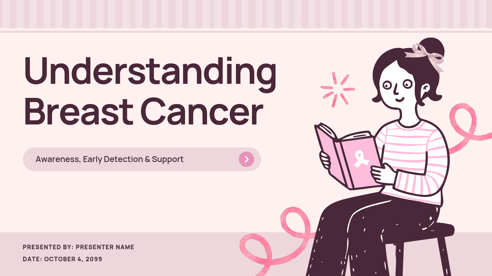
Nursing and health science programs run awareness campaigns as coursework, and health classes cover it as curriculum. Here the audience is younger than the at-risk population, so the useful framing is often what to know now and what to watch for later, plus how to talk to the older women in their families.
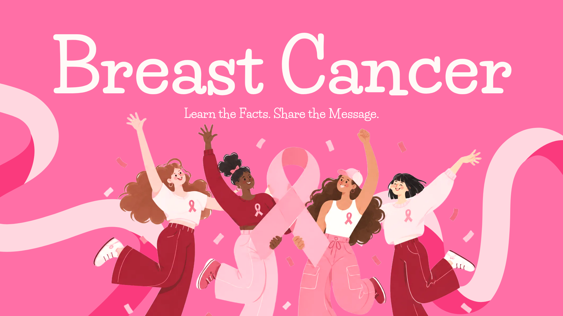
Campaign work can carry more energy than a clinical session without losing the subject. This template opens on illustrated figures with the line "Learn the Facts. Share the Message," which is already close to what a student campaign is trying to do.

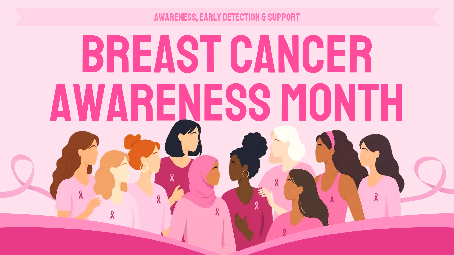
For a campaign that has to be seen across a lecture hall or reused as a poster, the bolder option works harder. The title is set in heavy display type over a band of illustrated figures, so it still reads from the back row.
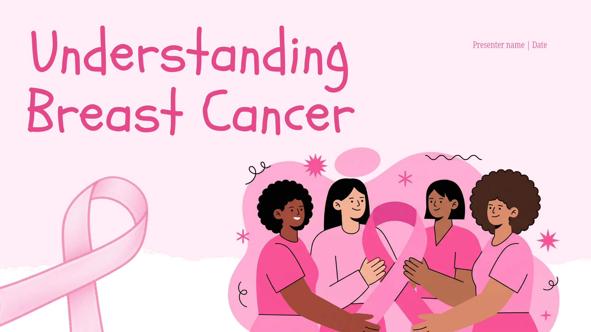
Nurses and educators use short decks with patients and families, sometimes right after difficult news. The register is completely different: fewer statistics, more practical clarity about what happens next, and no motivational language.
The brief here is calm and explanatory. This one leads with "Understanding Breast Cancer" over an illustration of women standing together, which suits a session where the job is to explain rather than to rally.
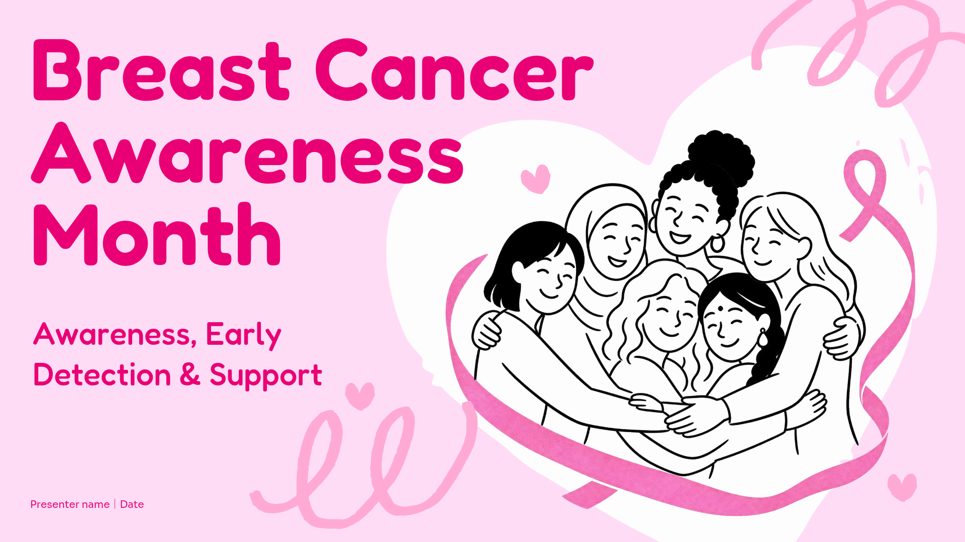
When the session covers what happens next, the gentler layout helps. Line-drawn figures sit inside a heart outline under the words awareness, early detection, and support, which is a softer opening for a room that may include someone recently diagnosed.
Awareness month events, faith groups, community centers. Mixed ages, mixed reading levels, often a noisy room. Big type, short lines, and one thing to remember.
Photography does more than illustration with a mixed public audience, because people recognize themselves in it. This template pairs a photo collage with a script headline and the line "Together, We Can Make a Difference," which fits an event rather than a lecture.

If the event is about spreading a message rather than marking a day, the alternative opens on a crowd of illustrated figures and the same "Learn the Facts. Share the Message" line, with enough room to put one sentence where people will actually read it.
Decide which of these settings you are in before you open any of them. A deck built for a lunch and learn will be too breezy for a clinic, and a clinic deck will be too clinical for a community hall.
One message, chosen deliberately. Decide whether you are there to encourage screening, to explain warning signs, to support a fundraiser, or to help colleagues support someone going through treatment. Those are four different talks. Trying to give all four gives none of them.
Statistics with a source and a year. Numbers give a talk weight and go stale quickly. Take current figures from the American Cancer Society or the CDC, put the source and year on the slide, and refresh them the following October rather than reusing last year’s deck untouched.
Use fewer than you want to. Three numbers a room can hold beat twelve it cannot.
Early detection, pointed at the right authority. Encourage people to talk to a clinician and to know what is normal for them. Do not put screening ages and intervals on a slide in your own words. Those guidelines differ between organizations and are revised over time, and a slide is exactly the wrong place for a summary someone might act on. Link the authority and let it speak.
Survivor stories, with consent and control. A first-person story will do more than any chart. It also carries obligations. Ask permission explicitly, let the person approve how they are described, and let them set the boundary on what is shared. Never use a survivor as a rhetorical device to make a point land harder. If you are using a published story rather than someone in your organization, credit it properly.
A specific action. End with one thing to do and the detail needed to do it: the number to call, the benefit to look up, the date of the screening day, the link to book. A talk that ends with "get checked" ends with a feeling. A talk that ends with a phone number ends with a task.
Pink is a signal, not a scheme. The color is recognizable, which is worth something. A slide that is pink on pink has spent that recognition and has nothing left for emphasis. Pair it with a strong neutral so the sentence you care about is the loudest thing on the slide.
Skip the empty ribbon. A pink ribbon on a blank slide is the most common breast cancer awareness slide there is, and it communicates nothing the audience did not already know. Use the ribbon small, as a mark of recognition, and give the space to the message.
Watch the battle language. Fight, battle, war, and lost her battle are everywhere in awareness materials, and many patients and survivors dislike them, because the framing implies that outcomes track effort. Plain language costs nothing and excludes nobody.
Choose images like the room is watching. Stock photography of distant women looking wistful reads as a mood, not a subject. Illustrated or photographic imagery that shows people of different ages and backgrounds does more, because the risk is not distributed evenly and the room is not uniform.
One idea per slide, readable from the back. Write the line, project it, and walk to the back of the room. If the key sentence is not readable from there, it is not on the slide, whatever the file says.
Leave silence around the hard parts. If you include a story or a difficult number, do not follow it immediately with a transition animation and a new heading. Let the slide sit. Delivery does as much work as design here.
Be ready for the room to respond. Someone may cry, disclose a diagnosis, or ask a medical question you cannot answer. Know in advance what you will say: that you are not a clinician, and where they can go. Have the authority link on the final slide so you are never improvising a referral.
The eight templates above have two things in common. None of them is a bare ribbon on a pink background, and each runs nine or ten slides, which is roughly the right length for a short session.
Treat any of them as a frame, not a script. Replace the sample copy with your one message, put your source and year under any statistic, and make the final slide your specific action rather than a thank you. Everything is editable in the MiriCanvas browser editor, including the photographs, so swapping in images that look like your audience is a matter of minutes.
If none of them fits the talk you have in mind, browse the wider breast cancer presentation templates and pick a layout that leaves room for your message rather than a theme you have to work around.
October, every year. Most workplace, school, and community sessions are scheduled during that month, so book the room and confirm any speaker in September. If your presentation supports a screening day or a fundraiser, the deck usually needs to be ready before the month starts rather than during it.
One clear message, a small number of current statistics with the source and year on the slide, an early detection section that points to a health authority rather than summarizing guidelines, and one specific action at the end. If you include a survivor story, get explicit consent and let that person control how they are described.
Yes. The eight templates linked in this article are free, and they open in the free MiriCanvas editor in a browser. You replace the text and images rather than building slides from scratch, and there is nothing to install.
Workplace lunch and learns and invited talks, nursing and health science classes, school health curricula, patient education sessions in clinics, and community or awareness month events. The setting should decide the tone and the length before you open a template.
Nine or ten slides suits most short sessions, which is why the templates here run to about that length. A lunch and learn usually has thirty to forty minutes including questions, and a patient education session is often much shorter. Plan for fewer slides than the time appears to allow, because this topic generates questions.
Assume someone in the room has been affected and write for them. Avoid battle and fighting language, which many patients dislike. Do not use a survivor story to make a point land harder. Do not offer medical guidance in your own words. Leave a pause after anything difficult, and say plainly where people can go for real answers.
Pick a free template, edit the text and images, and you’re ready in minutes.
Browse templates


