
Tools

AI資料作成
AIプレゼンテーション
BEST
AI文章作成·作文
AI ポスター
AIかんたん作成
AI画像生成
AI動画生成
HOT
AI キャラメーカー
AI アイコン作成ツール
AI アイコンメーカー
AIイラスト生成
AI ロゴメーカー
AI フリー背景素材
AIクイック編集
AI画像編集
背景除去
高画質化
写真イラスト化
HOT
New!

イラスト一覧を見る
幅広いシーンで使える高品質イラストをご用意しています。
Plans


Learn how to make a Black Friday flyer in 5 simple steps, from choosing a template and adding your offer to customizing and reviewing the final design.
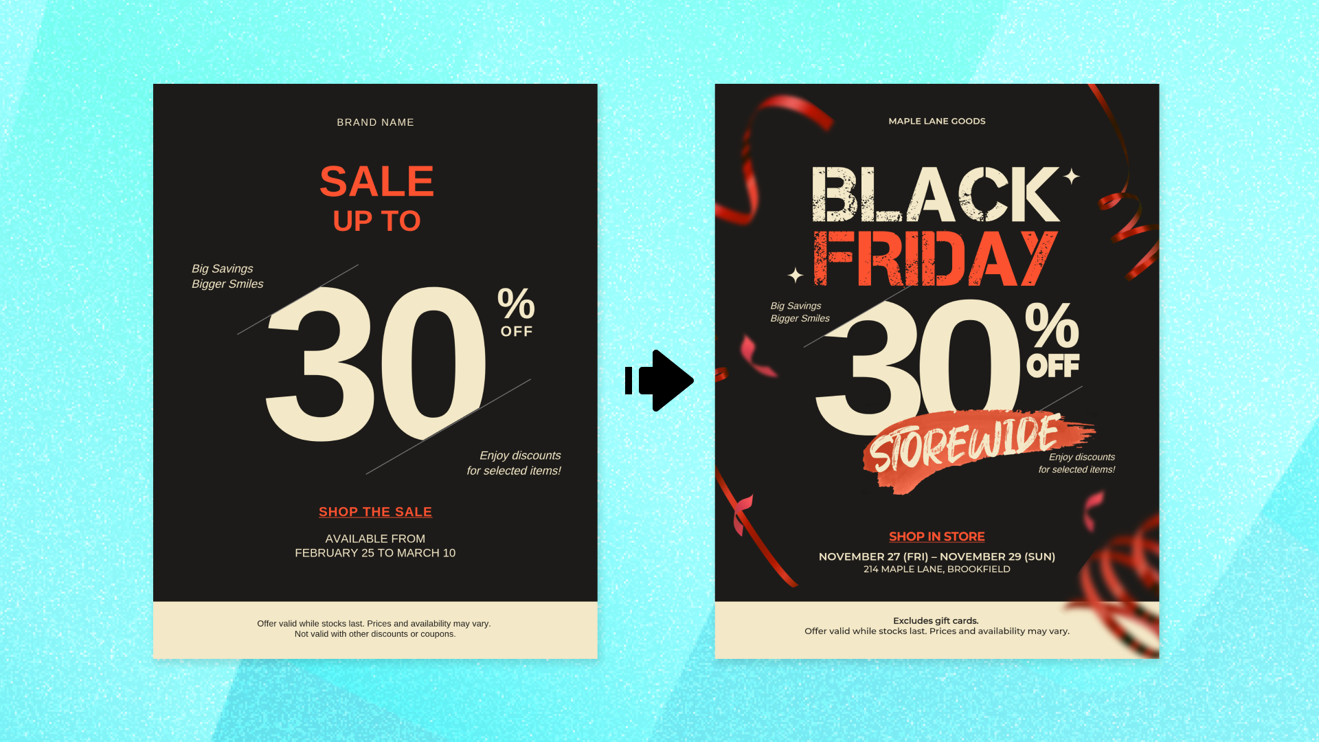
A Black Friday flyer needs to make three things clear: what your offer is, when it runs, and what shoppers should do next.
This walkthrough builds one flyer from an existing sale template to a finished Black Friday design for a small retail store. Every step uses the same flyer, so you can see exactly what changes as you go.
If you have not settled on a look yet, start with Black Friday flyer ideas and templates and come back here once you know roughly what you want.
Before opening a template, write down the information your flyer needs. For this walkthrough, we will use one fictional small retail store and keep the same promotion throughout the five steps.
Your primary offer. Our example is a 30% storewide discount. The finished flyer will lead with 30% OFF STOREWIDE.
Your sale dates. Black Friday 2026 falls on Friday, November 27. Our example promotion runs from Friday, November 27 through Sunday, November 29.
Your business name. Use the name customers will recognize.
Your call to action. Decide what you want shoppers to do next. For this example, the goal is to visit the store.
Any important conditions. Our example excludes gift cards, so that condition needs a place on the flyer.
Having these details ready makes it easier to judge which parts of a template you can keep and which ones need to change.
Start with the format. Our example is a printed handout, so we are using a US Letter template at 8.5 × 11 inches.
Then look at the structure of the template, not just the sample wording.
A template does not have to say “Black Friday” already to work for a Black Friday promotion. What matters is whether the layout gives your most important information enough space.
Look for:
Room for the main offer. Your discount or promotion should have a clear focal point that is easy to notice at a glance.
Space for the Black Friday message. You need somewhere to identify the promotion without competing with the offer.
Room for dates and store details. These should be easy to add without squeezing them into an already crowded layout.
A structure that matches your promotion. If you have one primary storewide offer, you probably do not need a template built around several products or multiple discounts.
For this walkthrough, we are using this MiriCanvas US Letter sale template.
Its simple layout already gives the discount strong visual emphasis, while leaving room to turn the general sale design into a Black Friday promotion.
Open the template and look at its existing hierarchy before changing anything. In this example, the large discount area is useful, but the generic sale wording and supporting details still need to become specific to our Black Friday promotion.
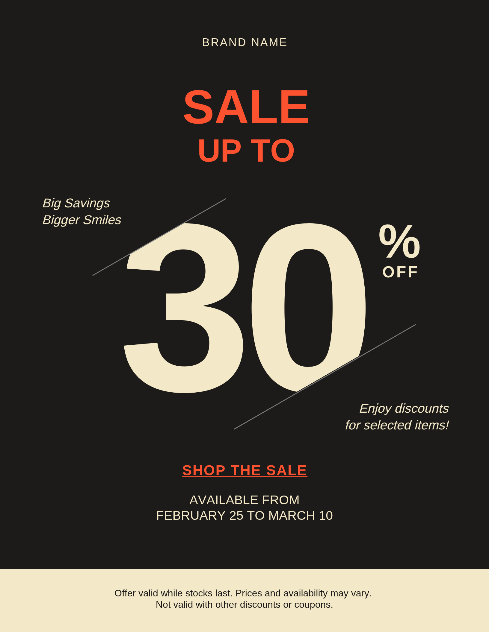
Start with the message before changing the visual details.
Our template already gives the discount a prominent position, but the sample sale wording needs to become specific to this promotion.
For our example, change the main message to:
BLACK FRIDAY
30% OFF STOREWIDE
The exact arrangement can follow the space available in the template, but the goal is simple: shoppers should be able to identify both the occasion and the primary offer at a glance.
If you have more than one promotion, you do not have to remove every secondary deal. Instead, establish a clear hierarchy. Decide which offer should attract attention first, then keep supporting offers visually secondary.
For this example, we will keep the flyer focused on one storewide discount.
Next, add the information shoppers need to understand and use the promotion.
For our example, the sale runs:
Friday, November 27 – Sunday, November 29
Including the day names alongside the dates makes the timing easier to understand without requiring shoppers to work it out separately.
Then add the business information and any important conditions.
Our example still needs:
Sale dates. Friday, November 27 – Sunday, November 29
Business name. The name customers will recognize
Condition. Excludes gift cards
Call to action. Shop in store
Store details. The information shoppers need to find the location
Keep the condition visible but secondary to the offer. "Excludes gift cards", for example, does not need the same visual weight as "30% OFF STOREWIDE", but it should still be readable.
The call to action and store information also have different jobs. A phrase such as Shop in store tells the reader what to do, while the address or other store details tell them where to do it.
At this point, the flyer contains the information it needs. Now you can decide which parts of the original template still fit your business and which ones need to change.
Color. Black and red are common in Black Friday promotions, but they are not requirements. You can keep a more restrained palette or introduce colors that fit your business, as long as the offer remains easy to distinguish from the background.
Contrast. Make sure "BLACK FRIDAY" and "30% OFF STOREWIDE" stand out from the supporting information. Dates, conditions, and store details can take a secondary role, but they should still be easy to read.
Typography. Check how the new wording fits the original layout. If changing "SALE" to "BLACK FRIDAY" makes the headline feel crowded, adjust the size or arrangement rather than forcing the new text into the same space.
Spacing. Replacing sample copy can change how much room each section needs. Give the main offer enough space to stand on its own, and avoid filling every open area with additional text.
Decoration. Look at the decorative elements already in the template and decide whether they still support the new Black Friday message. Keep the elements that help frame the offer and remove or adjust anything that starts competing with it.
You do not need to change every part of the template. Keep what already works and focus your edits on the elements that make the flyer clearer and more relevant to your business.
Before using the flyer, check it from the shopper’s point of view.
Is the offer obvious? At a quick glance, can you identify "30% OFF STOREWIDE" without searching for it?
Are the dates easy to find? Make sure shoppers can quickly tell when the promotion starts and ends.
Is the next step clear? If you want shoppers to visit the store, say so clearly and make the information they need to find it easy to locate.
Are the conditions readable? Supporting information can be smaller than the main offer, but it should still be legible at the size the flyer will actually be used.
Does the design work at its final size? This example uses a US Letter layout, so review the flyer at 8.5 × 11 inches rather than judging it only while zoomed in on the editor.
Is any sample content left behind? Check every line for placeholder text, sample dates, business names, or other content inherited from the original template.
If you also need a version for social media, carry over the campaign’s offer and visual direction but adapt the layout for that placement. A square social post and a US Letter handout have different proportions and viewing conditions, so they do not need to use exactly the same arrangement.
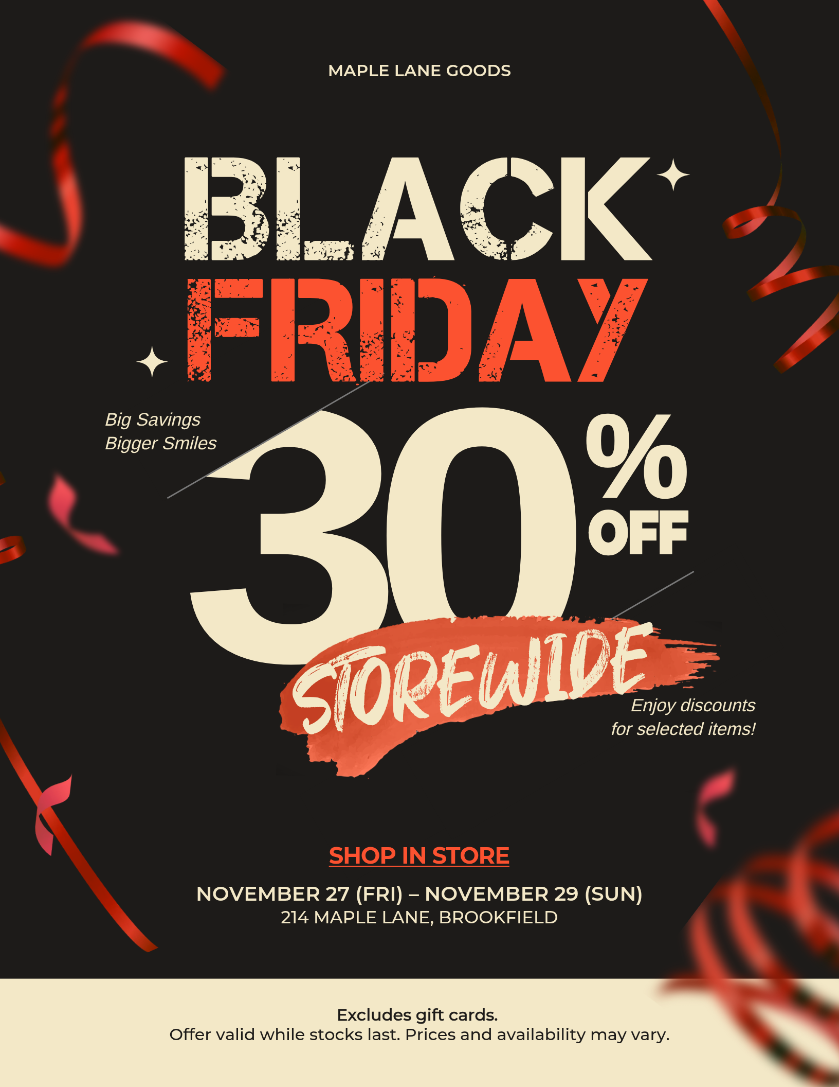
Start by deciding your primary offer, sale dates, business information, call to action, and any important conditions.
Then choose a template with enough room for that information, replace the sample promotion with your Black Friday offer, add the dates and details, customize the design for your business, and review the finished flyer at the size where it will be used.
Make the primary offer one of the most prominent elements in the design. Give it enough size and contrast to stand apart from the dates, business details, and supporting text.
If you have more than one promotion, establish a clear hierarchy instead of giving every offer the same visual weight.
Plan on adapting the design for social media rather than simply reusing the printed layout unchanged.
You can carry over the same offer, colors, typography, and other campaign elements, but a social post has different proportions and is viewed differently from a US Letter handout. Adjust the layout and amount of information for the placement where it will appear.
The same process still works. Your primary offer might be buy one, get one free, a fixed-price bundle, a gift with purchase, or another type of promotion.
Give that offer the visual emphasis that the percentage discount receives in this example, then build the dates, details, and call to action around it.
Work backward from the date you want to start promoting the sale.
If you are printing flyers, allow time for final review, printing, and placement. Digital versions may follow a different schedule, but it still helps to have the offer, dates, and campaign design finalized before you start creating each version.
Pick a template, edit the text and images, and your poster is ready in minutes.
Browse Templates


